
Product page optimization should be a top priority for any ecommerce brand.
Not thrilled with your current conversion rate? Maybe it’s time to put your product pages under the microscope. Recent eMarketer data notes the highest ecommerce conversion rates come via desktop at 3.8%.
Given how conversions vary among industries, should that be your benchmark? Not necessarily.
Should you still look for low-hanging ways to optimize your product pages? Absolutely!
That’s exactly why we wrote this post that covers:
- Five best practices of ecommerce product pages any brand can follow
- Product page inspiration and examples you can adapt yourself
- Ecommerce tools (paid and free!) to help with optimizing product pages
5 Ecommerce Product Page Best Practices You Can Put into Action ASAP
We’ll bite: there are tons of variables that influence whether or not someone makes a purchase. There’s no “sure thing” when it comes to conversions.
That’s why anything you can do to increase the chance of an on-site sale is a plus.
The good news? These five product page optimization opportunities don’t require you to revamp your storefront.
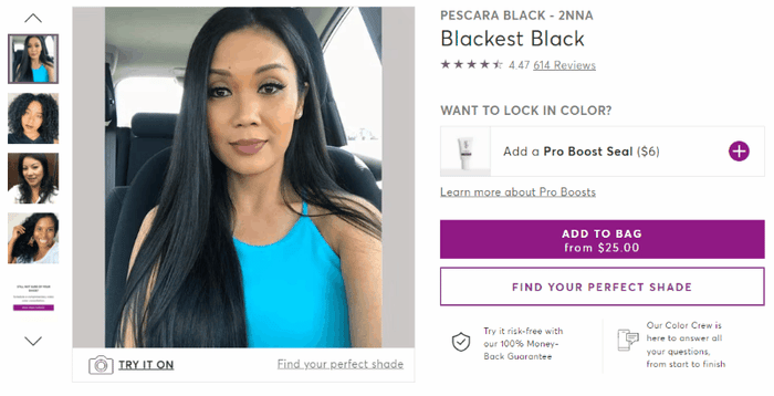
1. Build Trust by Featuring Customer Photos and Videos
Seeing is believing for modern shoppers.
Fact: conversions lift by a staggering 91% when visitors interact with user-generated content. This includes customer photos and videos showing off your products in action.
Why is UGC so impactful, though? Consider that:
- Real photos of real people signal that you’re a legitimate brand with satisfied customers
- Action and lifestyle shots make it easier for people to imagine your products in their hands
- UGC provides context that people just can’t get from a static product page photo
The takeaway? High-quality images are great but authentic customer content is more meaningful. These benefits highlight why brands should repurpose their UGC and influencer content in their product pages.
Product Page Examples and Inspiration
Madison Reed’s storefront is a shining example of how to put UGC front and center. Rather than hiding their customer content below the fold, you can scroll through it right alongside the product description.
 Source: Madison Reed
The more you scroll through, the more customer content you see. Like most beauty brands, Madison Reed sources their UGC directly from Instagram. Note the emphasis on authenticity (“Real Clients, Really Gorgeous Results”) in their customer feed.
 Source: Madison Reed
The best ecommerce product pages are ones that are able to tell a story. Who better than your own customers to tell yours? For example, JVN’s product pages pack a one-two punch with a combo of customer testimonials and photos. The brand does a brilliant job of showcasing before-and-after results as a form of social proof.
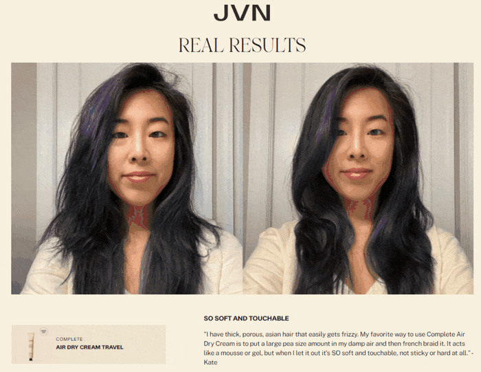 Source: JVN Hair
Ecommerce Tools for Product Page UGC
- Featuring UGC on your product pages is easier said than done if you try to gather it yourself. Statusphere's consumer-to-consumer marketing platform helps brands collect royalty-free UGC at scale. We streamline the process of sourcing and asking for permission to promote your customers' posts throughout your marketing funnel. This includes emails, social media and (most importantly!) product pages.
2. Use Positive Reviews to Reassure and Retain Shoppers
Pop quiz: when’s the last time you bought something without reading a review first?
Probably never.
Well, the same rules apply to your potential customers. Check out this recent survey on ecommerce product page best practices. Data notes that reviews (62%) and star ratings (38%) are among the most important elements of a positive shopping experience.
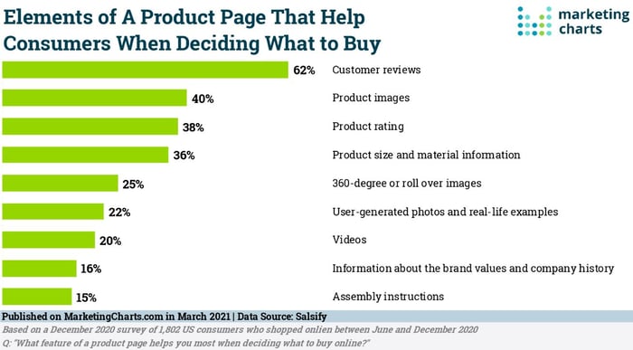 Source: MarketingCharts.com
Food for thought: 70% of consumers read between one and six reviews before making a purchase.
Having firsthand customer reviews on-site creates a sense of trust, sure.
But also consider how promoting multiple reviews can keep people from bouncing to a third-party site. Preventing that bounce goes hand in hand with reducing cart abandonment.
And in turn, your conversion rate doesn’t have to suffer.
Social proof and customer reviews on product pages are both proven conversion boosters. Another added bonus of reviews is that customers can uncover the benefits of your products that you might not think of yourself.

Product Page Examples and Inspiration
Lime Crime illustrates pretty much all of our product page best practices so far. They provide a place for customers to upload photos alongside their reviews. This approach lets you highlight UGC without having to source it yourself.
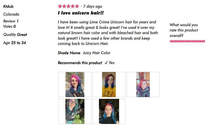 Source: Lime Crime
Check out how Sketchers has an in-depth rating distribution chart on their product pages. This breakdown includes common phrases used in reviews, pros, cons and whether their products fit as advertised. This level of detail definitely does the job of reassuring skeptical shoppers.
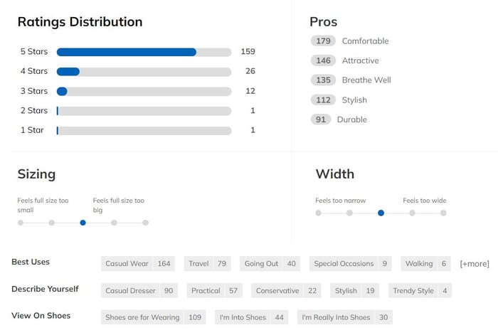 Source: Skechers.com
Ecommerce Tools for Sourcing Product Page Reviews
- Reviews.io is a customizable tool that highlights specific product attributes (like how something fits) in detail. You can see a snapshot of their platform below. They claim that brands that show reviews on product pages see an 18% higher conversion rate and an 11% higher average order value.
- Opinew (for Shopify) boasts features such as bulk imports that brands can filter to find the most relevant reviews possible. For example, you can separate reviews by whether they have photos or a specific star rating. The platform can source reviews from Amazon, Oberlo and more.
- Judge.me is a review aggregator notable for having a “forever free” plan. Oh, and 140,000+ users across Shopify, Squarespace and WooCommerce.
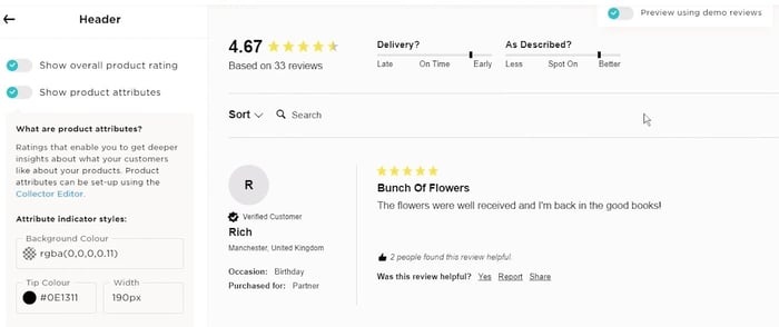 Source: reviews.io
3. Win More Shoppers with Exit-Intent Pops and Sticky Bars
Did you know that 75% of people expect free shipping for all online purchases under $50?
Meanwhile, consider that 89% of millennials (and 78% of Gen Z) would try a totally new brand if they were offered a discount to do it.
This data speaks to the importance of offers, discounts and free shipping for modern shoppers. Specifically, how important it is to make sure that those offers and discounts are can’t-miss.
A well-timed pop-up can do the trick, granted you aren’t pushy and don’t interrupt your visitor’s experience.
We know what you’re thinking:
Are pop-ups really in line with modern product page best practices?
There’s a reason why they’re still a staple of online shopping. Like it not, pop-ups work when done right.
The key is to set up triggers so your pop-ups are relevant and not totally in-your-face. Most ecommerce tools using pop-ups have features to ensure your offers aren’t served too aggressively. Instead, you have to set up certain conditions before your pop-up is presented to visitors. This might include:
- Spending a certain amount of time on your website (or a certain page)
- Visiting a specific # of pages on your website
- Scrolling through a certain percentage of a product page (think: 25% or 50%)
If someone ticks these boxes, it signals serious intent and the fact that your pop-up will be targeted.
If traditional pop-ups aren’t your jam, consider how static “sticky bars” can promote offers without being as direct. These bars may not be as eye-popping as pop-ups. That said, they’re still effective for earning opt-ins and keeping shoppers from seeking deals elsewhere.
Most sites featuring sticky bars use them to hype up a free shipping threshold. Here’s an example from Hally Hair Color:
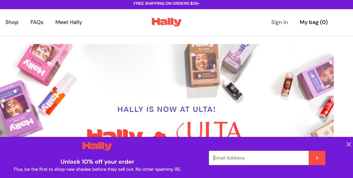 Source: hallyhair.com
Research from OptiMonk notes that the top 10% of their platform’s pop-ups saw a staggering 42% conversion rate (and 11% overall). Are these positive results the norm? Maybe not.
That said, this highlights that visitors at large do respond to pop-ups when they’re relevant to them. That means:
- The pop-up is presented based on specific visitor conditions
- The offer is relevant to the visitor based on their on-site activity
- The pop-up feels like it was written by a human, not a robot
Note: this tip is an example of product page optimization that you can apply throughout your website. For example, you could trigger different types of messages across your homepage, landing pages and category pages.
Product Page Examples and Inspiration
Check out how Fjallraven presents their 10% discount as a friendly invitation (“Join us on the trail”). This message is on-brand and doesn’t feel spammy. Although the pop-up isn’t super personalized, the fact that it’s delivered while browsing a pricier item makes it feel more relevant.
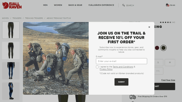 Source: fjallraven.com
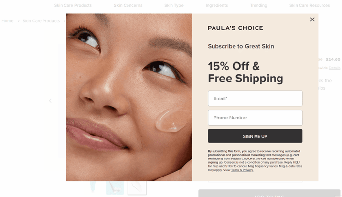
Here’s another example from Paula’s Choice. The double whammy of free shipping and 15% off is an enticing offer.
Ecommerce Tools for Building Pop-Ups and Sticky Bars
- OptiMonk is a straightforward pop-up builder that integrates seamlessly with Shopify. The platform provides merchants with tons of creative freedom, too. For example, you can create surveys, gamified popups, and countdown offers. An added bonus is the platform’s massive library of pop-up templates and the actual average conversion rate of each.
 Source: optimonk.com
- ConvertFlow has a dedicated drag-and-drop sticky bar builder that’s super easy to use. Again, sticky bars are much less in-your-face and a great way to promote your “always-on” offers. These bars can be applied to your product pages or throughout your entire site.
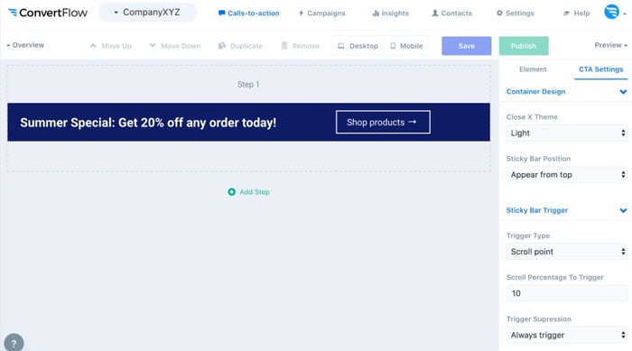 Source: convertflow.com
4. Highlight Key Details with Product Comparison Charts
Product comparison charts are an underrated opportunity to increase AOV and conversions alike.
Consider that the best ecommerce product pages aren’t necessarily laser-focused on one product. Comparison charts are a way to condense multiple pages’ worth of details into one image.
The concept is simple. By placing similar product variants side-by-side, buyers can understand the big-picture details of what you’re selling. These breakdowns encourage shoppers to hone in on exactly what they should buy.
Variant charts help your visitors make a purchasing decision without forcing them to dig through additional product pages. That creates a more positive shopping experience. If nothing else, charts discourage visitors from bouncing.
The key to effective comparison charts is defining the most important aspects of your products. You have to be picky. Rather than overwhelm shoppers, focus on product details that can be condensed into a few words or simple “yes/no” statements. This might include:
- Price point
- Key ingredients and materials
- Aesthetic details (colors, shades, tones)
Product Page Examples and Inspiration
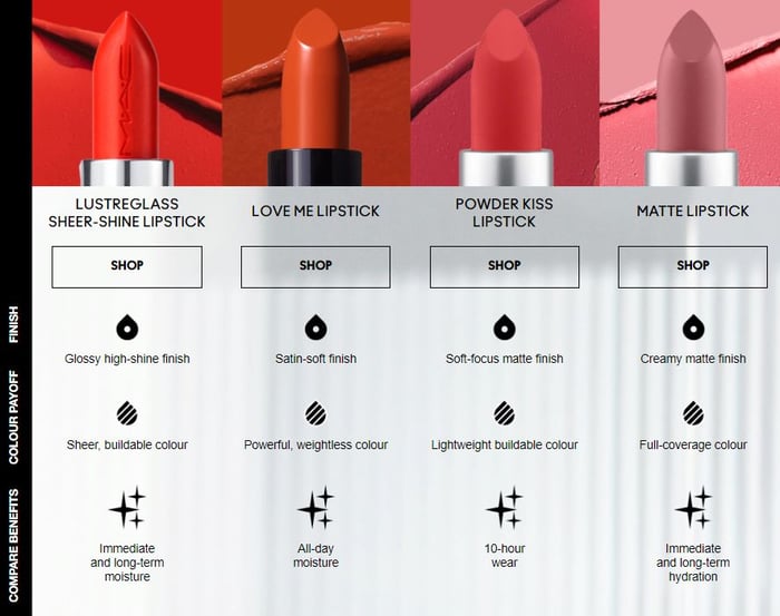
MAC Cosmetics’ lipstick comparison chart is brief but does its job done beautifully. Coupled with actual product photos, shoppers can understand at a glance which product variants are right for them.
 Source: maccosmetics.com
Here’s another example from IT Cosmetics that’s super straightforward. When in doubt, keep your charts short and sweet.
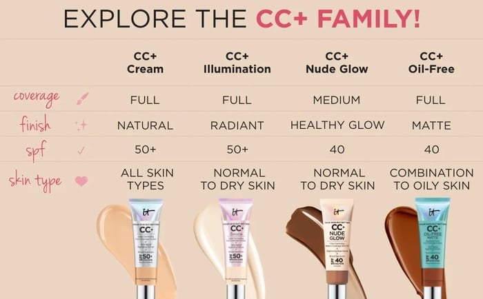 Source: itcosmetics.com
Note: both of our product comparison examples are from the beauty industry. That’s because beauty brands often sell products that seem identical at first glance. Given that modern skincare shoppers are so particular about ingredients, explaining product variants is crucial. The same rules apply to any brand that sells variant products categorized by styles, shades or flavors.
Ecommerce Tools for Creating Product Comparison Charts
Many freemium ecommerce tools have product comparison chart templates you can adapt yourself. The platforms below all have similar drag-and-drop features to build charts from scratch:
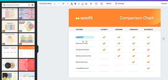 Source: Canva.com
If you’re working with a designer or design team, creating branded charts for your most popular products is a solid starting point.
Remember: you don’t need to write a novel for your shoppers. Once a product on your chart piques someone’s interest, then they’ll be ready to read further. You don’t want to risk analysis paralysis. As illustrated by our product comparison examples, up to five columns and rows seem to be the sweet spot.
5. Provide a Better View Using Roll-Over and Hover Images
“Okay, so what does this actually look like?”
Again, anything you can do to help shoppers imagine your products in their hands is a plus.
That means being proactive and anticipating your shoppers’ concerns. Clearing up their questions can be done in a matter of seconds with a thoughtful product image or two.
Remember what we said earlier about “seeing is believing” for modern shoppers? The data doesn’t lie. Looking again at research on ecommerce product page best practices, 40% of consumers say that product imagery matters. Specifically, 25% of shoppers note that they want to see roll-over or hover images.
This is an aspect of product page optimization that often goes under the radar. In fact, research from Baymard also says that 70% of ecommerce sites don’t show these types of images. This represents a huge window of opportunity for brands that do.
Roll-over and cover images might not seem like game-changers. That said, consider how they:
- Highlight product variations (different colors, models)
- Provide close-ups and alternative angles of products
- Showcase products in different settings (think: your product on white background vs. a hover-over of user-generated content featuring your product)
Chances are you engage with roll-over and hover images all the time when you shop. Thing is, you probably don’t think twice about them. That’s kind of the point, though. These photos serve as a seamless way to learn more about products by just dragging your mouse.
Product Page Examples and Inspiration
Wet n Wild Beauty features zooms of each of their product photos to give shoppers a closer look. If nothing else, zooms like this ensure that your product pages don’t look like they were made for ants.
 Source: wetnwildbeauty.com
Here’s an example of a hover image in action from Kate Spade. The combination of blank product shots versus action shots is a smart move. This provides a simplified view of any given product while also highlighting what it looks like in a real-world setting.
 Source: Kate Spade
Ecommerce product page design is a key piece of optimization. Hover and roll-over images are a subtle but significant way to engage visitors effortlessly. Featuring these images establishes expectations and answers “What does this look like in real life?”
Ecommerce Tools for Presenting Roll-Over and Hover Images
The tools available for multiple product views vary based on your ecommerce platform of choice. For example, merchants using BigCommerce can try a tool like Magic Zoom Plus.
Alternatively, you can also take a DIY approach by implementing hover images with a bit of CSS knowledge. This guide from Shopify breaks down how.

Time to Put These Product Page Optimization Tips into Action!
Listen: there is no one-size-fits-all approach to optimizing your product pages.
Any combination of the tips above can position your site for a better customer experience and more conversions. Thanks to all the tools out there, putting these ecommerce best practices into action doesn’t have to be a total time-sink.
The common thread between these best practices, though? Giving your product pages a personal touch.
The more creators and customers you have talking about your brand, the easier it is to showcase real people on your product pages.
Need help building word of mouth and sourcing valuable customer content from social media? Statusphere can help. Our full-service platform can scale your social media creator campaigns that result in compelling content featuring your products in action.
Want to know how the process works? Talk to one of our consumer-to-consumer marketing specialists to understand how we can get creators posting about your brand ASAP.