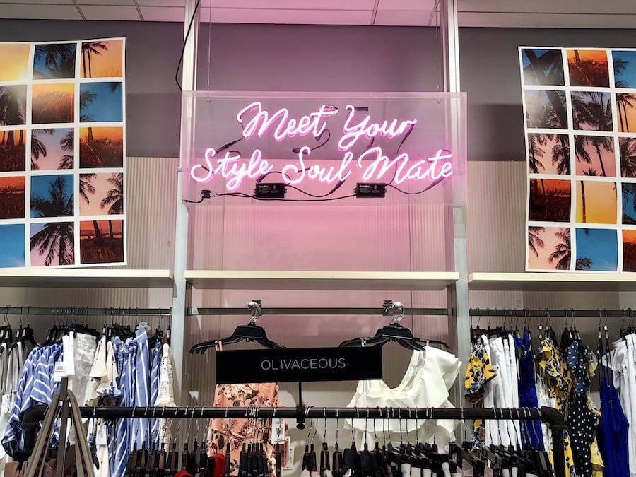
Driving in-store sales is all about wowing consumers.
When people are shopping, they usually fall back onto products they have tried before that are familiar.
If you want retail customers to reach for your product over their usual or go out of their way to try something new, then you have to grab their attention. Utilizing in-store marketing materials can make that happen. Here are some of the options we recommend that will really pull in customers.
Interactive Displays
People love to interact with a product before they make a purchase. We’ve broken down a few examples by industry for your brand to grab some inspiration below.
Beauty brands:
Lush has a great handle on setting up low-tech interactive displays.
When you walk in the store, you can see, smell and touch all of their products. They always have a display with a colorful bath bomb dissolving, creating a sense of something magical brewing. And their staff are trained to let you sample just about everything the store has to offer.
Lush’s natural beauty line of face masks and makeup has a full demonstration available if you ask any of the in-store staff.
Tech brands:
If your product is high-tech, creating a moment where users can interact and know what to expect from your product is a valuable selling point. Think of any Apple store you’ve ever walked into — the retail customer is able to see, touch and use the device before making a purchase. This creates a memorable and honest shopping experience that makes consumers feel more comfortable paying for big-ticket items.
Home goods brands:
If your product is less about tech and more about style, try using interactive mirrors and screens. Many online retailers are using augmented reality to promote sales of their products. You may think that's not needed when you’re physically seeing products like furniture in person, but being able to see the item in your own space before you bring it home can easily be the decision definer. For example, IKEA implemented VR design technology to highlight their kitchen redesign capabilities. Setting up kiosks that allow you to link photos or provide dimensions of your space to see how these items fit can change the experience and make an indecisive buyer pull the trigger.
Color Matching Aids
Color-matching materials are brilliant in the fashion and beauty space. If your retail customer is looking for the perfect foundation, you can put them at ease by providing samples, testers and interactive aids. If you don’t have the capacity to have a beauty consultant on hand to help, creating materials that will help guide your retail customers to their perfect shade will help prevent bad reviews due to improper matching.
For skin products, providing a guide for matching cool, neutral and warm skin tones is a great way to simplify the foundation process. Creating a display that explains how to tell the undertone of your skin is a great use of time and money — and it shows that you know your buyers' struggles. You could even go further and create testers of your other products in packets, like lipstick or eyeshadow, that would play well with the consumers’ undertones.
In-store, Sephora uses their Pantone Color IQ to help customers determine their perfect match. Implementing a low-tech version of this system is entirely possible to create a positive experience for your retail customers.
Using User-Generated Content in Displays
When pieces of your product or display are user-generated, it adds an extra layer to the consumer experience. The genuine interaction between customers and fans makes them feel like a part of your community instead of a number on a sales sheet. This is further illustrated by the rise of influencer marketing for retail support.
Creating this sense of community and a brand identity that is inclusive of that community can help pull in new customers and keep repeat customers coming back.
Back in 2016, Starbucks came up with a great campaign to engage its customers and create a product together. In response to the negative reaction to their green holiday cups, they launched their red cup design challenge. The brand released a plain red cup and encouraged their avid coffee consumers to design that year's holiday cup. This led to over 1,200 submissions and a lot of hype, ultimately culminating in 13 designs from all around the globe being featured.
Running user-generated campaigns can be a lot of work (especially if you’re trying to leverage them to draw in retail customers). From creating the campaign goals, spreading the word, analyzing the submissions and implementing the results, there are a lot of things that can fall through the cracks.
If you want help implementing a killer user-generated campaign to support your in-store marketing materials, contact us here. Our team of industry gurus at Statusphere is here to help!
